project brief:
LaTrina, an electrologist, wanted a rebrand for her private electrolysis studio. In our initial consultation she expressed wanting to incorporate an electricity symbol along with brighter colors and continued involvement of curves.
project outcome:
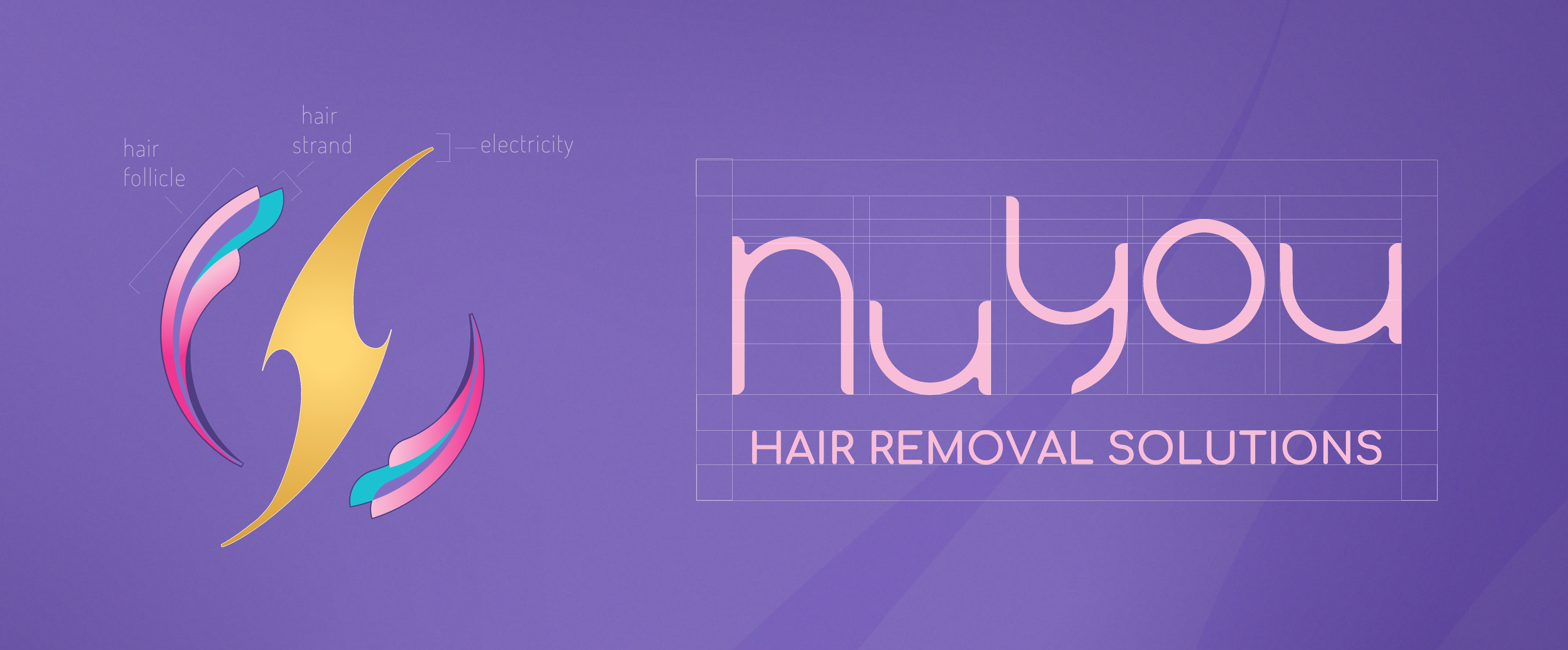
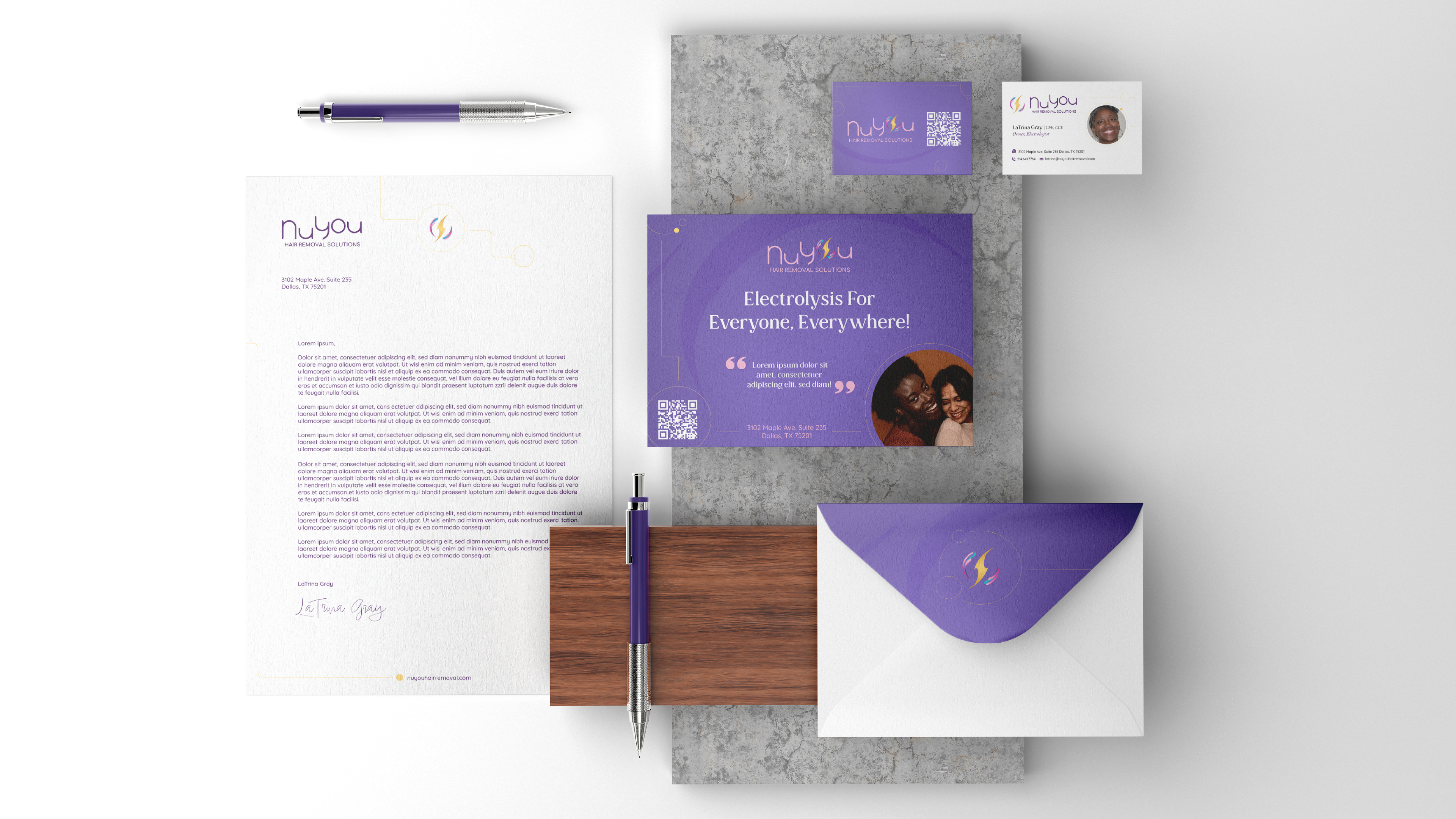
I concepted a logo mark that involves a curved electricity symbol encircled by two hair follicles. The wordmark is made from the font "Moon Swing". I edited each of the letters to curve corners, lengthen and shorten legs and stems, and reworked the spacing to create a brand specific wordmark.
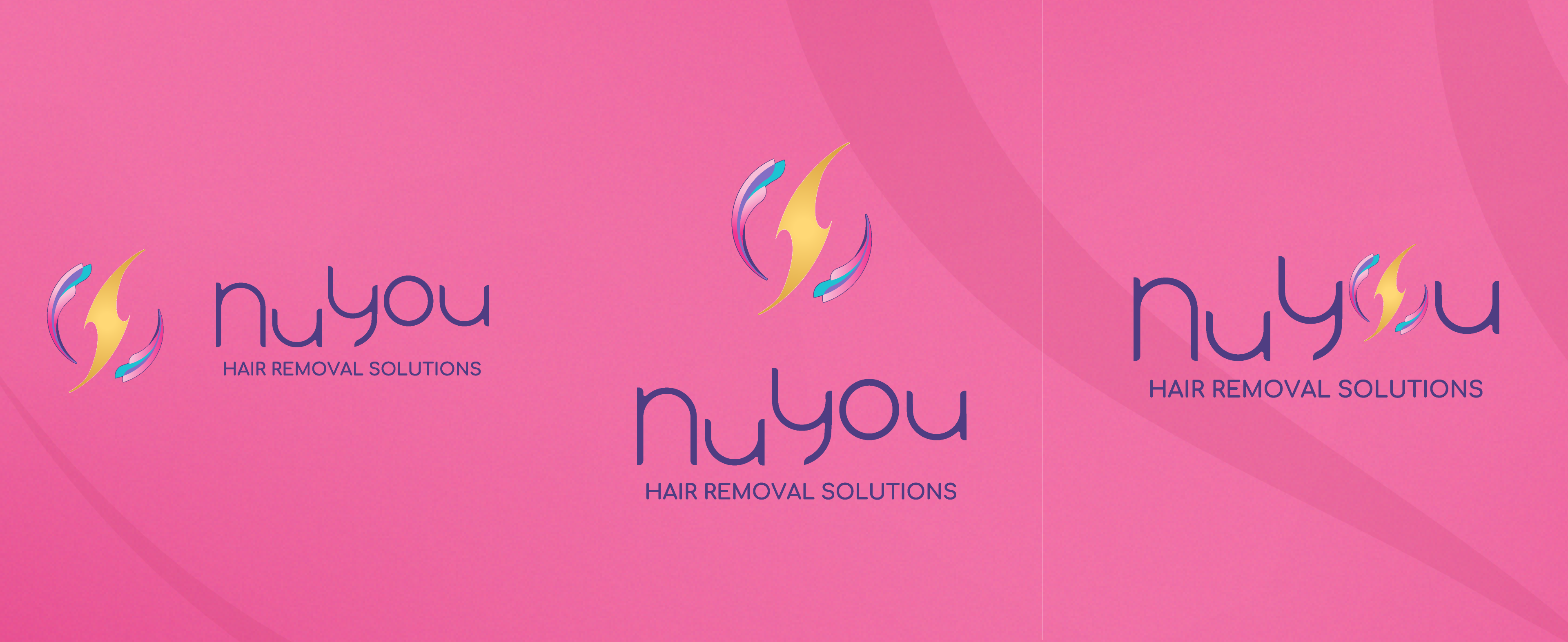
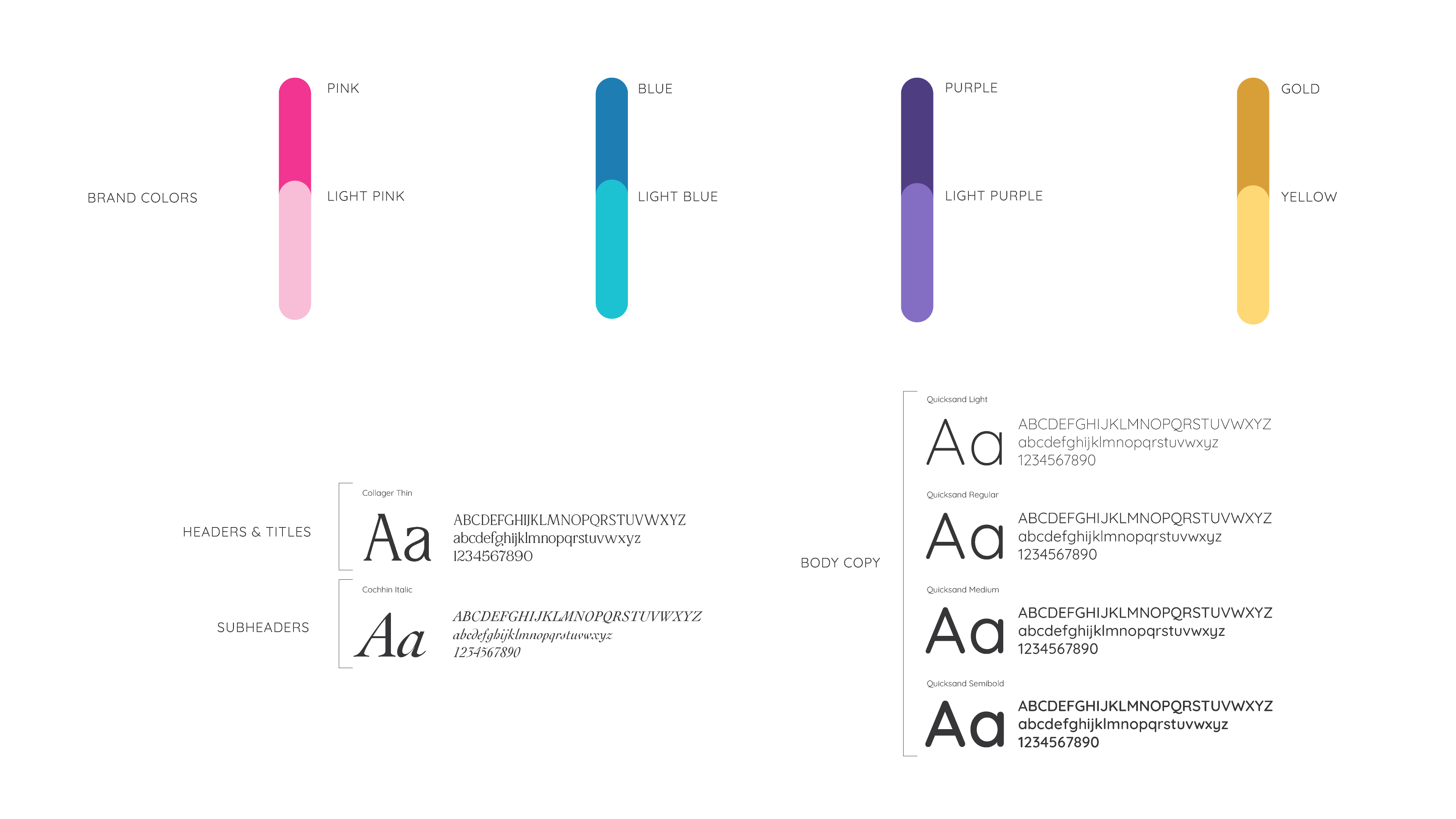
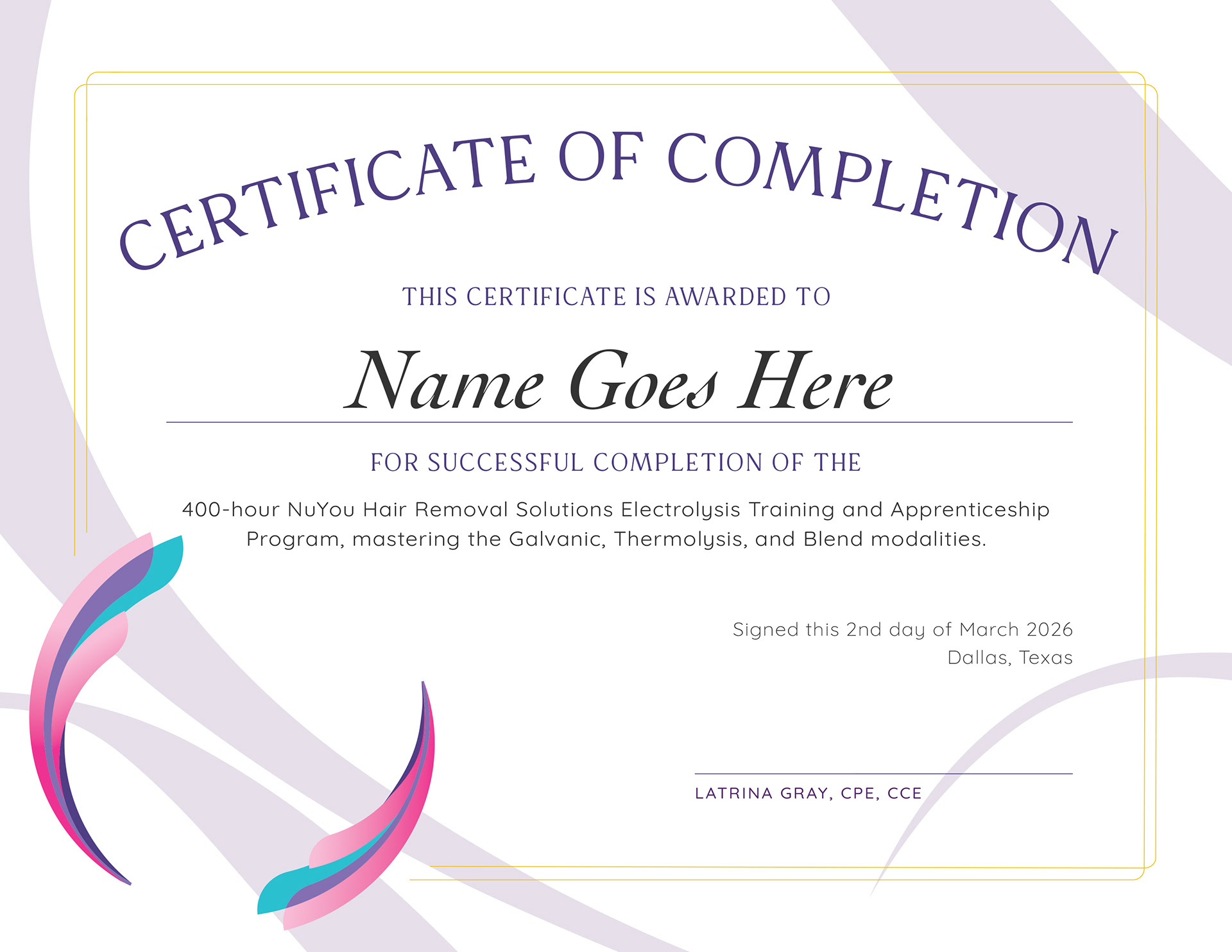
The brand features three logo variations, four main brand color-ways, and an abstracted electrical circuit to add visual interest and dimension to the brand.
The client also manages a growing TikTok for her practice and requested a frame concept for branded TikTok videos.

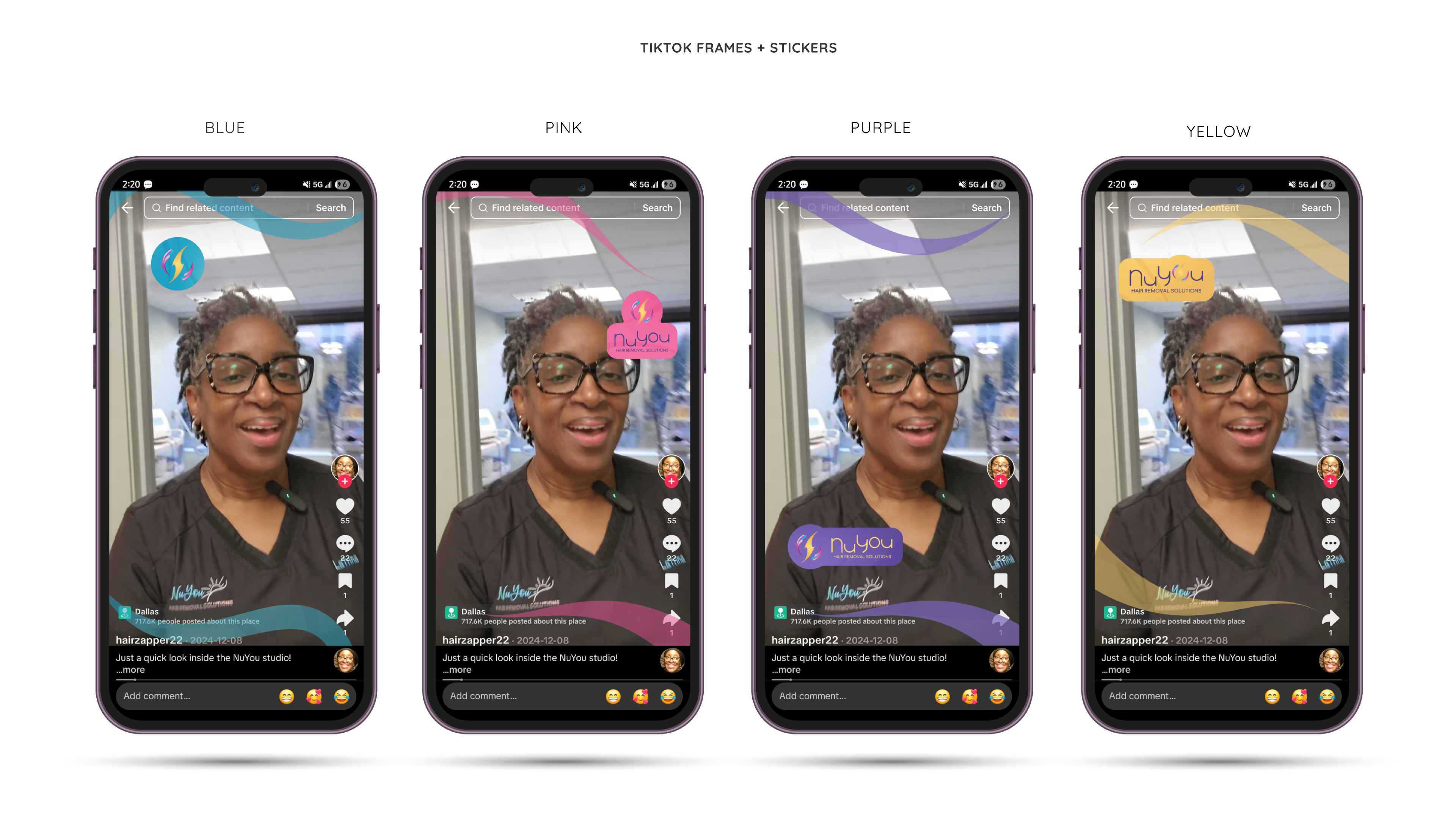
Tik-Tok Video Closing Edits (fig 01)
(fig 02)
(fig. 03)